Visual Identity + Art Direction for course finder LearnerBee which helps align users find their purpose.
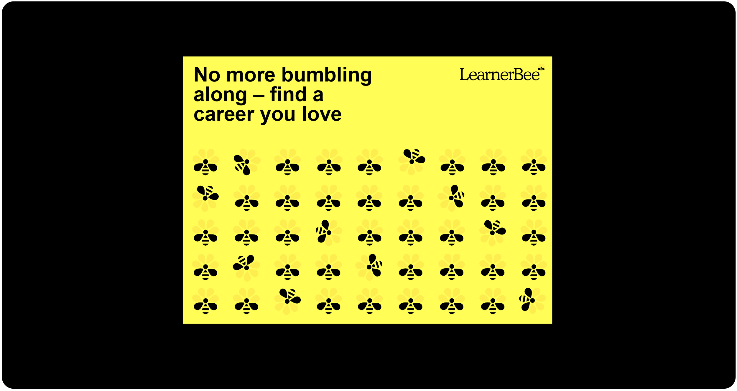
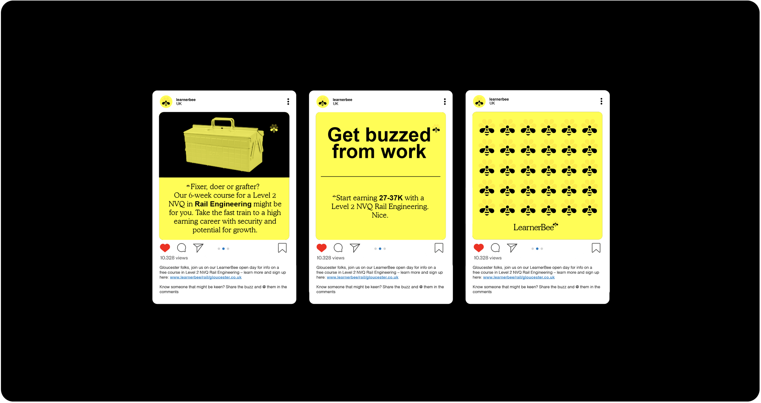
LearnerBee is a straight talking brand and platform which helps people create work opportunities and purpose for themselves through low cost courses that truly suit their nature. These courses would otherwise become unfunded leading to less opportunity and more unemployment. The identity design balances a bold no-frills functional aesthetic to speak to our audience demographic. Our iconic yellow and black core palette compliments our name creating a memorable and confident look and feel.
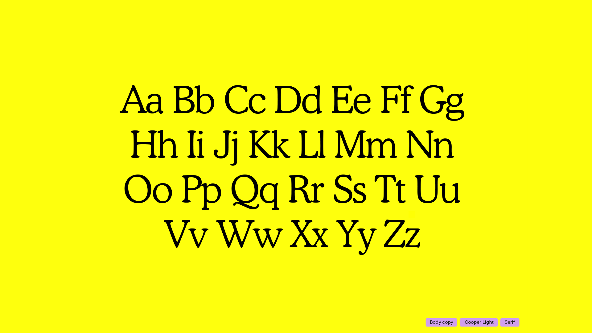
Our word mark’s serif letterforms mimic the antennae/feeler like features of the humble bee, and brings a distinguished yet inviting warmth to the name.
Our icon sits at the edge of the word mark like and asteriks and is also integrated into our comms as a functional graphic allowing for two levels of Buzzy and Fuzzy information.
We have two brand typefaces. Arial is a functional, no-cost and no fuss typeface which brings the Buzz to our language and tone of voice. Our secondary typeface was created to bring a more distinguished tone to our comms.
A yin and yang color system of yellow on black or black on yellow exists to speak to and differentiate between comms for our two audiences (the student and the education organisation).
Creative Roles
Creative Direction + Art Direction + Design
Collaborators
Robyn Cusworth – Writer
Cleber de Campos – Soundboard